CAPE of good hope
A powerful tool for investors to value markets

Yes, that picture is of the Cape – of good hope, just outside Cape Town in South Africa.
I was lucky enough to get down there in 2016 to visit my son who was completing his medical studies in Cape Town Hospital.
If you get the chance, do visit Cape Town at some point; the scenery is incredible and so are the vineyards.
Just be sure to take advice on where you stay and go – not everywhere is safe.
Okay, so before this turns into a travel blog, let’s get back to making this dull financial stuff interesting – with a simple explanation of the ‘CAPE’ a powerful tool for investors.
What is the CAPE?
Let’s start with the last bit first.
The P.E. part of C.A.P.E stands for Price to Earnings ratio, and a PE is found by taking the price (P) of a company share (or a whole market of them) and dividing it by the earnings (E) produced by that share (or market)
Simples.
Now you might conclude that, at any given time, if the ‘P’ (relative to the ‘E’) is higher than usual, then that share (or market) must be overpriced, right?
Yes, you might conclude that, but unfortunately, it’s not quite that simple 😉
You see, company profits (aka Earnings) tend to bounce up and down a fair bit – from year to year – even in normal times – such as they exist.
Those earnings bounce around even more for companies operating in what we call ‘cyclical’ industries.
Think about house builders for example.
They enjoy times of feast but also suffer from times of famine.
One way to get a better idea of the ‘fair value’ of a share (or market) is to ‘adjust’ (average in this case) the earnings of that company (or all companies in the market) over a reasonably long timescale, say 10 years, to take out the effect of the business cycles.
And that’s pretty much all there is to it.
Just take the current market price and divide it by the average (inflation-adjusted) earnings over say 10 years, you’ve got yourself a CAPE.
CAPE stands for Cyclically Adjusted – Price to Earnings ratio.
It does what it says on the tin; it cyclically adjusts the PE.
What use is it?
Well, it offers us a clue as to whether markets are wildly over (or under) priced.
It’s not perfect of course. So, for goodness sake don’t use it (or anything else) for that horrendously dangerous game of ‘day trading’ the markets.
The CAPE can, however, offer us better information on longer-term trends than a single year PE.
Is this the latest fad investment idea?
Not a bit of it, a couple of smart guys (Benjamin Graham and David Dodd) came up with the idea in 1934!
Then another smart guy (Nobel Prize-winning, Professor Robert Shiller of Yale University) took their idea and gathered in the data for the US stock market, all the way back to 1880.
What’s more, Shiller makes his data available for free online at www.econ.yale.edu/~shiller/data.htm
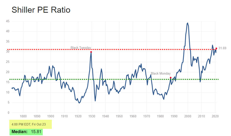
I’ve simply used that data to show that the US stock market (by historical standards, on this metric at least) is looking very expensive now.
You can access regular updates, like this one, from this ‘Multipl’ site too.
What do you think?
Is the US Stock Market looking expensive or cheap?
Is the CAPE a perfect predictor of future returns?
No, it’s not perfect; there is no such thing as the perfect market predictor, so run a mile from anyone who tells you there is.
What’s hopefully clear from that picture above, is that the CAPE ratio has moved across very long ranges over time.
It’s been down as low as five and up to nearly 45, though I think most (reasonable) people would agree that 1999 was a ‘one-off’.
While for much of the time (in the mid ranges) the CAPE offers few clues at all, it can be helpful to identify times (as now) when we’re in an extreme valuation Zone – either very high or low – by historical standards.
These are clearly times of heightened risk, or opportunity for the brave when the CAPE is very low.
What’s rather sad, is how this CAPE indicator loses its friends in the investment industry when it offers warning signals.
Too few people on the ‘sell-side’ of the investment industry are prepared to give honest and balanced opinions about risk.
Some do, though, and you can learn more about them here.
They include Jeremy Grantham of GMO – who offers some strong risk warnings here.
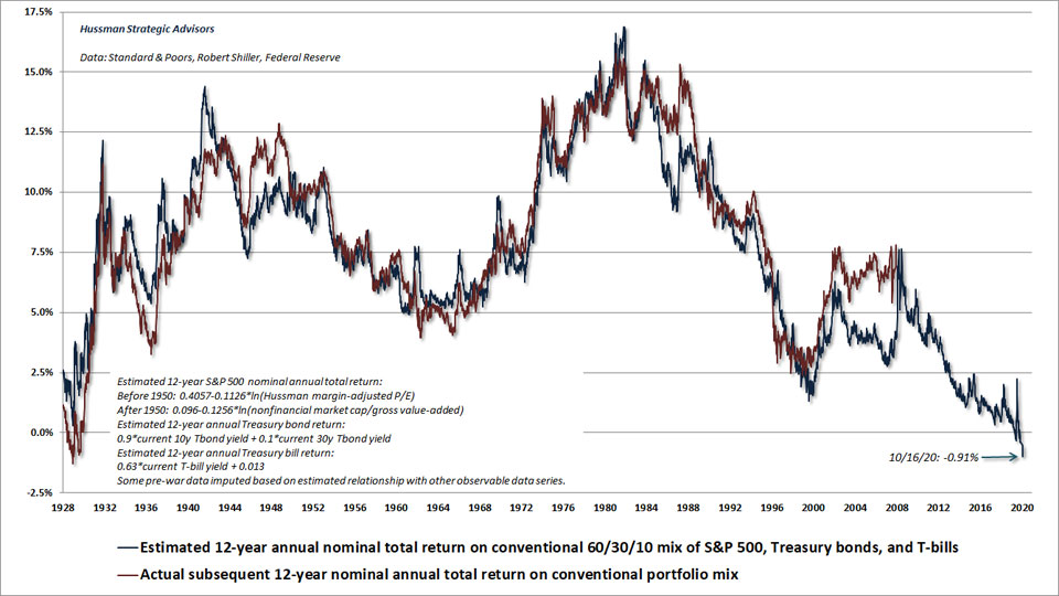
And John Hussman, whose own margin adjusted PE metric (MAPE) has actually been more closely correlated to future market returns than the CAPE.
This is what the MAPE says (my words) about valuations now.
12-year return prospects are now negative
and that’s before inflation!
The simple truth is this:
Whenever the CAPE is high, some experts will tell you that’s fine – and that it’s NOT a warning sign of poor prospective returns.
The eternal optimists will grab at any story they can find, to support their ‘investment sales’ story, and some stories, like ‘missing the best days’ are grossly misleading too.

Someone who’s paid to sell funds, or keep you invested in the funds you have, might tell you that the CAPE is not that high now because:
- ‘of a structural change in corporate profitability’, or
- ‘Globalisation has boosted the reach and earnings power of US companies’, or
- ‘the reduced volatility in economic indicators mean a higher risk/return level is justified.
But I’m not totally convinced by these arguments, especially the last one, right now, are you?
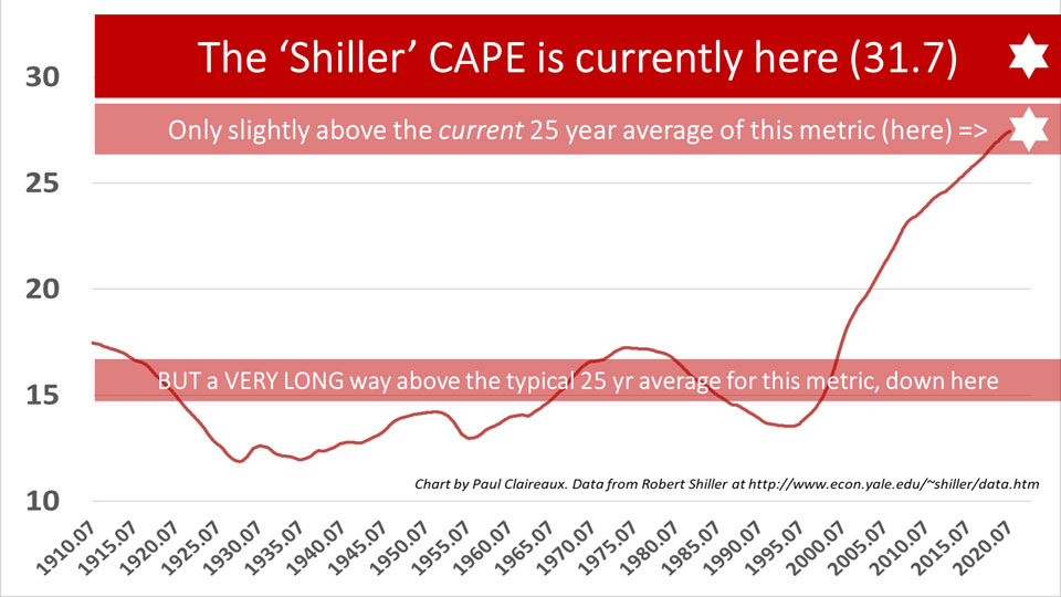
I mean just look at this picture, of the 25 year moving average of the CAPE over time.
You’ve really got to believe that ‘this time is very different’ to believe these fund sellers are right.
The guys from Research Affiliates pointed out in 2018 here, that there’s no good reason to believe that company profits have moved up onto a permanently higher plateau, and remind us that company profit margins and earnings as a share of GDP revert to the mean.
They’re “sceptical that earnings can grow much in the years ahead, relative to GDP, without causing a populist backlash”
I agree, and you could argue that it was only due to a twist of fate that the US electorate elected Trump in their last election.
What would a Biden Presidency mean for corporate profitability and the regulation of excesses?
What about other indicators?
Well, this is the other classic trick played by the ‘sell-side’ of the fund industry.
When the most widely agreed valuation metric isn’t working for them, they dig out others, that are not quite as frothy!
The trouble with most other indicators is that they don’t smooth out company earnings – so they’re simply a snapshot in time.
Or, worse, they’re based on the, invariably optimistic, forward projections of earnings from analysts.
It is true that any price to earnings ratio, including those that ‘smooth out’ earnings over a period, is imperfect. And whatever length of period you choose to smooth earnings (ten years in Shiller’s CAPE) the numbers are still affected by the history of earnings fluctuations during that period.
Until the earnings crash during the financial crisis (2007-09) fell out of the ten-year window, the optimists told us that that particular ten-year period was not a representative sample.
It’s true that real earnings, as measured by Professor Shiller, did fall by c. 90% from the summer of 2007 and that there’d been no greater earnings fall over such a short period in all the data back to 1871.
However, this only tells half the story.
The remarkable bounce-back in company profits that followed was bigger than the profits crash in 2008-09.
So, yes, there have been some incredibly big shifts in company earnings over the last ten years, but they’ve been both up and down – which is precisely why using ‘average’ company earnings over a decent period makes a lot more sense than taking a snapshot of a single year.
We really do need to see the big picture – as here – for some proper perspective.

My view remains, therefore, that the CAPE (and Hussman’s MAPE) are worth keeping an eye on – at least while we’re in the extreme zone.
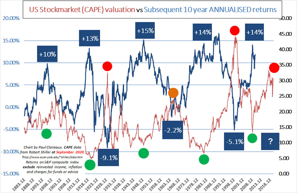
At the time of writing, these measures suggest that stocks (in the USA at least) are very overpriced, and if you look at this next picture, you can see how (in the past at least) future returns have been broadly (and negatively) correlated to the CAPE starting point.
Listen to Robert Shiller
To quote Shiller himself on the potential ‘averaging’ errors – in his own measure (FT 2013)
… I’m a behavioural finance type, and I understand that people make all kinds of investing errors.
In a purely public spirit, I want to make it simple and easy. Ten years is very simple.
I would have preferred to make it an exponentially weighted moving average but we tried that and it didn’t seem to make any difference.
You also have something that’s easy to explain.
Here is Shiller again – from a debate in May 2017
Stocks have generally outperformed other investments through history.
They are highly priced now, which means I don’t expect them to outperform so much.
But for a long term investor, there should be a place for stocks in a portfolio.
They could go up a lot, but could also go down a lot”
You won’t get a clearer message than that 🙂
More interestingly from that (May 2017) article was Shiller’s expectation of long term (10+ years) US market, real (above inflation) returns of just 1% p.a.
So, after normal charges on most portfolios that would mean that you’d enjoy zero or less real returns. And that’s really not an exciting prospect, especially when you consider that simple cash deposits have produced similar (inflation matching) returns over the long term, and they don’t crash in value.
The problem right now is that cash deposits are delivering negative returns vs inflation – and that’s exactly why investors are chasing other assets in search of a return. Even the central banks recognise these risks, as I outlined here.
More criticisms of the CAPE
Some pundits argue that we shouldn’t use a measure which, because of differing tax rates over the years, has delivered different after-tax returns to investors. What matters, they say, are the after-tax returns.
Yes, this is a reasonable challenge, and thanks to John Authers (in the Financial Times, February 2010), we learn that Alain Bokobza (an analyst from investment bank Société Générale) undertook the grisly task of ‘normalising’ the data for varying corporate tax rates over the period.
Those tax rates rose from 12% before 1932 to 35% in 2010, with a peak of 50% in the 1960s, and to normalise the earnings across the period, he increased the tax rate in the low tax/early years and reduced it in the high years.
Those adjustments apparently give slightly less deep troughs in the CAPE, at about 6.5 for 1932, 9.9 in 1982 and 13.3 (close to the actual low) in 2009.
Anyway, at the current CAPE of 32, we’re a long way above any average… however you try to ‘tweak it’ for long term consistency.
Valuations change quickly and may be out of date when you read this Insight, so look up the latest numbers.
Other critics of CAPE say there’s no point in using historic earnings data – it’s the future that matters for where stock prices will settle.
That’s true also, but no one knows the future, do they? 😉
Analyst forecasts are very often wrong (by a lot) and over-optimistic, which makes them quite useless at a danger point.
At least we can see the past, it’s real and in this case, we’ve got the data over a very long period.
Another criticism of the CAPE is around what to use as a reasonable average. In other words, where should we say the normal range should be?
This is tricky to answer because the average is simply a function of the period over which you measure it.
Take the average over the 1990s and it would be a lot higher than the longer-term average – as we saw above.
Some argue that it’s valid to ‘lift’ the CAPE average now because the companies that make up the US stock market are different to twenty years ago. There are lots more high tech stocks which, have tended to trade on higher multiples.
The counter to that is whether the likes of the FANGMAN stocks (Facebook, Amazon, Netflix, Google, Microsoft, Apple and NVIDIA) will continue to justify trading on significantly higher multiples by continuing their meteoric growth rates long into the future?
I have my doubts, but if you like that argument you might like to adjust your CAPE – according to the ‘sector’ weightings of the stock market in question.
Indeed, this is precisely what the guys at Star Capital produced in April 2018 and still found that US stocks were significantly overpriced.
The bottom line?
The CAPE is not a perfect market predictor because no such thing exists, but it’s a useful indicator of value – for those prepared to take the long view on investing.
It can help us see when stock markets might have gone haywire, when valuations are at wackily cheap or expensive levels, relative to long-term history.
Yes, it’s rough and ready and it doesn’t promise any precision.
So, it’s a lot more honest than using a normal distribution model – or other devious means to mislead investors about risk.
More on the problem with the ‘normal model’ here and here, and in case you missed the link earlier, here’s the ‘missing the best days’ myth-buster blog again.
What we can say for sure is that the CAPE value model is more useful than simply saying that markets are fairly priced at all times.
‘The Price is Right’ was a fun family TV game with Bruce Forsyth (in the UK) and should not be used as an excuse for heavily exposing people to stock markets regardless of the climate.
We know why some advisers (those wedded to constructing their own investment portfolios) find it difficult to develop an investment advice process that takes account of bubbles and crashes.
In short, to do so could be very difficult to manage and to communicate. So they tend to stick with broadly ‘static’ asset allocations for a given client’s risk profile, regardless of market valuations … and you need to bear this in mind when you engage an investment adviser.
If you’ve not tested your adviser on this, now is the time to do so.
Thanks for dropping in
Paul
For more ideas to achieve more in your life and make more of your money, sign up to my newsletter
As a thank you, I’ll send you my ‘5 Steps for planning your Financial Freedom’ and the first chapter of my book, ‘Who misleads you about money?’

Also, for more frequent ideas – and more interaction – you can join my Facebook group here
Share your comments here
You can comment as a guest (just tick that box) or log in with your social media or DISQUS account.
Discuss this article