The sales person’s favourite chart
And why it's no use to you

The red line chart below is the financial sales person’s favourite chart about stock-market investing.
Let’s see why it’s most likely NO use to you at all.
Now, you might well have seen this nice, upward sloping chart of stock-market returns before . . .

My Osteopath tells me that this is his financial sales person’s favourite ‘chart’
It never takes long for this chart to be pulled out of the bag, he says 🙂
I have a little chuckle to myself every time I’m shown it.
Notice how it slopes beautifully up to the right hand side?
And that, surely proves, beyond any possible doubt, that a stock market based investment is the best you could ever make. Right?
Well, no, not necessarily
You see, the trouble with this chart is that it’s drawn over a ridiculously long timescale.
And that’s usually the case – typically they show returns over 70 years or more.
Now, I don’t know about you, but . . .
. . . I don't know many people with an 70-year investment time horizonClick To TweetThat’s not to say that investments can’t perform well over much shorter periods – they most certainly can.
It’s just that the chances of suffering losses are much higher over shorter terms.
And we’re not going to get a handle on the shorter term risks in Stock Markets by looking at this nice (apparently) smooth chart of the super long term.
It hides the big bumps !
So, if you must look at charts then look at charts which:
- Cover both good and bad times for stock markets
- Start from high valuation points as well as low and which
- Cover much shorter periods of time – that are more in line with the term of your expected investment.
And even if you do have a very long term investment horizon . . .
. . . you’ll still find it useful to know just how fund prices could move in the next few years.
Very few people are able to remain relaxed when they see big falls in their investments over a couple of years – never mind the long term.
Just ask any adviser who was in business during the crisis of 2000-2003 or 2008-09.
This is just the sort of chart you need to understand – because it shows you examples of extreme investment returns.
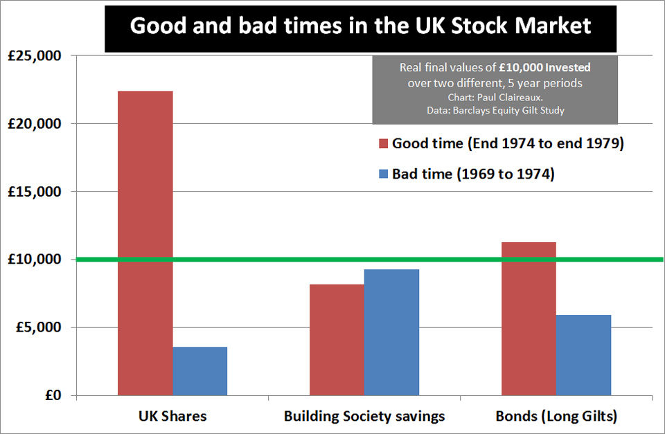
This chart looks at two separate 5 year periods:
The first is from 1969 to 1974
And over this period you’d have suffered a real (inflation adjusted) loss on the UK stock market of c. 65% 🙁
The second period is shows is from 1974 to ’79
During which time the few who were brave enough to have invested in late 1974, would have made +120% (in real terms) on the UK stock-market
Now, I’ve chosen a five year period to look at these extremes because it illustrates the point perfectly.
Yes, it’s true to say that 5 years is a short period for investing a lump sum.
And it’s also true to say that negative real returns over longer terms have been rare in the past – although not so rare from valuation levels like todays.
Take a look at this extraordinarily nasty 20 year period in the 1970s.
For the first 18 years of this period you might well have been very pleased with yourself had you invested heavily into the stock market in 1954.
Until, that is you had all your gains (and more) wiped out in the following 2 years 🙁

So, what anyone tells you – there are no guarantees of big profits on stock-markets – even over longer terms – and especially not if you invest at ‘high’ valuation points like now.
And if your investment time horizon is between 5 and 10 years – you really want to think carefully on that point.
5 years is normally the minimum term over which advisers will ask you to consider ‘investing’ your money into ‘risky’ assets of any kind.
So, it’s worth knowing just what ‘could’ happen – to both Stock Market and Bond types of asset over this timescale.
Some advisers will argue that 5 years is too short a period for investing.
But, as ever, what’s right will depend on your personal circumstances AND on your attitude to risk AND, most importantly, on your capacity for investment risk on your particular savings or investment goal.
If you learn nothing else about investing – remember that.
You’ll hear me mention it – time and again – on this site.
So am I predicting that markets will fall heavily over the next 5 years?
Well, no, of course I’m not. Markets could:
- Carry on rocketing upwards as they have done for the past 9 years OR
- They could bumble along sideways for a while OR
- Climb slowly upwards for a while OR
- Drift downwards slowly over time OR
- Collapse in a crash.
No one knows what will happen. No one.
That said, it’s worth noting that most intelligent commentators agree that both stocks and bonds are at record high valuation levels right now.
So, upside potential does look limited from this point.
And downside risk looks high.
But the key point in this Insight is simply this . . .
Your Financial Education is the key
We all need to learn how to manage and plan our money.
And learning about the risks (as well as the benefits) of investing in Shares and Bonds is a key part of that.
So, just remember this Insight, the next time you talk to a financial sales person – and they try to ‘gloss over’ the risks of investing . . .
. . . perhaps with a silly, super-long timescale chart – like that one above
You could even refer them to this page 😉
At least then we’d all be sharing the same FACTS about RISK eh?
And take good care out there
Paul
Please share your thoughts in the comments below.
You can log in with your social media or DISQUS account OR to “post as a guest” – just add your name and that option will pop up.
For more ideas on money and life
Join my Facebook group here

Or sign up for my newsletter
With which you can also have my ‘5 Steps for planning your Financial Freedom’
and the first chapter of my book, ‘Who misleads you about money?’
All free of course 🙂

Discuss this article